Storybook Tutorial
How to use the visual UI catalog for ShipRules AI — with real examples from the app.
What Is Storybook?
Storybook is a visual catalog of every screen and component in your app. Each item in the catalog is called a story. Stories render with mock data — no database, no API, no Shopify login needed.
Without Storybook
To see the Dashboard, you need to: install the app on a Shopify dev store, log in to the admin, click the app, wait for data to load...
With Storybook
Open a URL. Click "Dashboard" in the sidebar. See it instantly with mock data. Switch to mobile view. Check accessibility. Done.
The Interface
When you open Storybook, you see three areas:
Sidebar — lists all stories, grouped by Pages and Components. Click to preview.
Canvas — renders the selected story with Polaris Web Components.
Toolbar — viewport switcher, zoom, accessibility checker.
Here's what it actually looks like:
Page Stories — Full Screens
Page stories show complete app screens. These are what the merchant sees inside the Shopify admin.
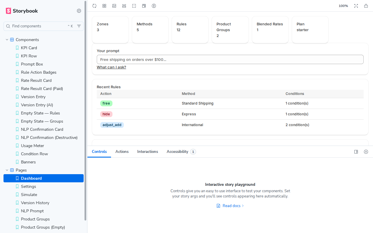
Dashboard
The main screen: KPI cards (Zones, Methods, Rules, Groups, Blended Rates, Plan), the NLP prompt box, recent rules table, and plan usage metrics.
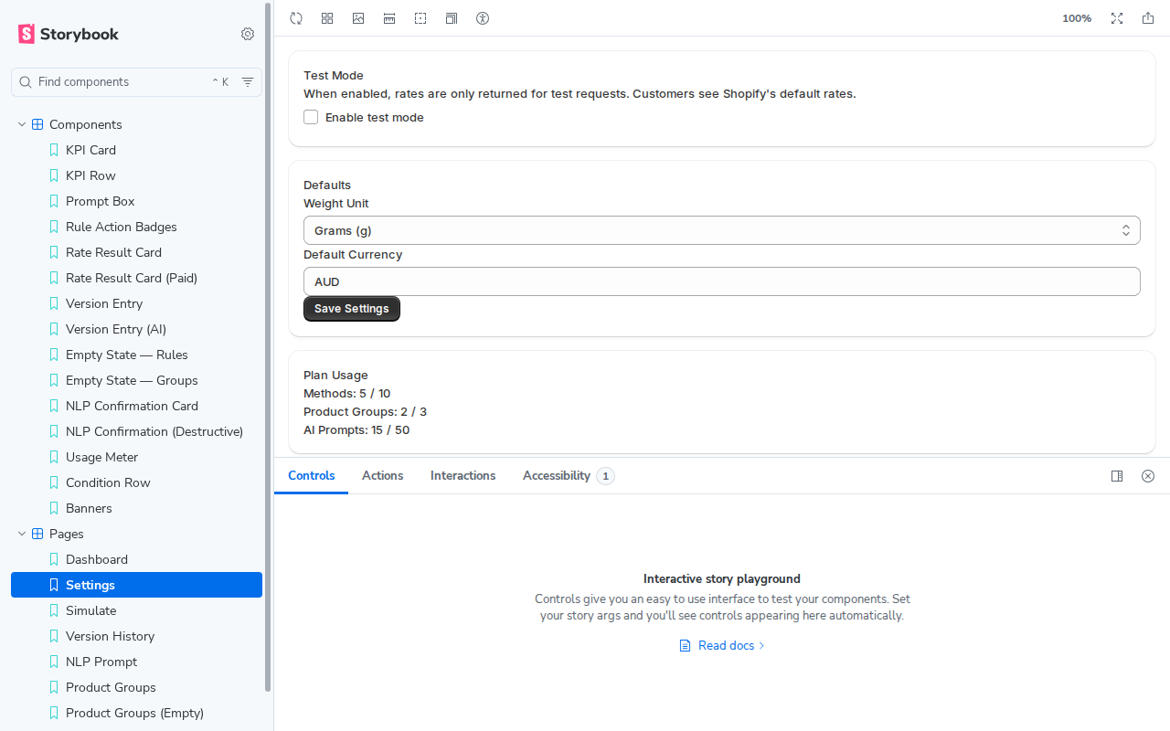
Settings
Shop configuration: test mode toggle, weight unit, currency, import/export, API keys, and shop info.
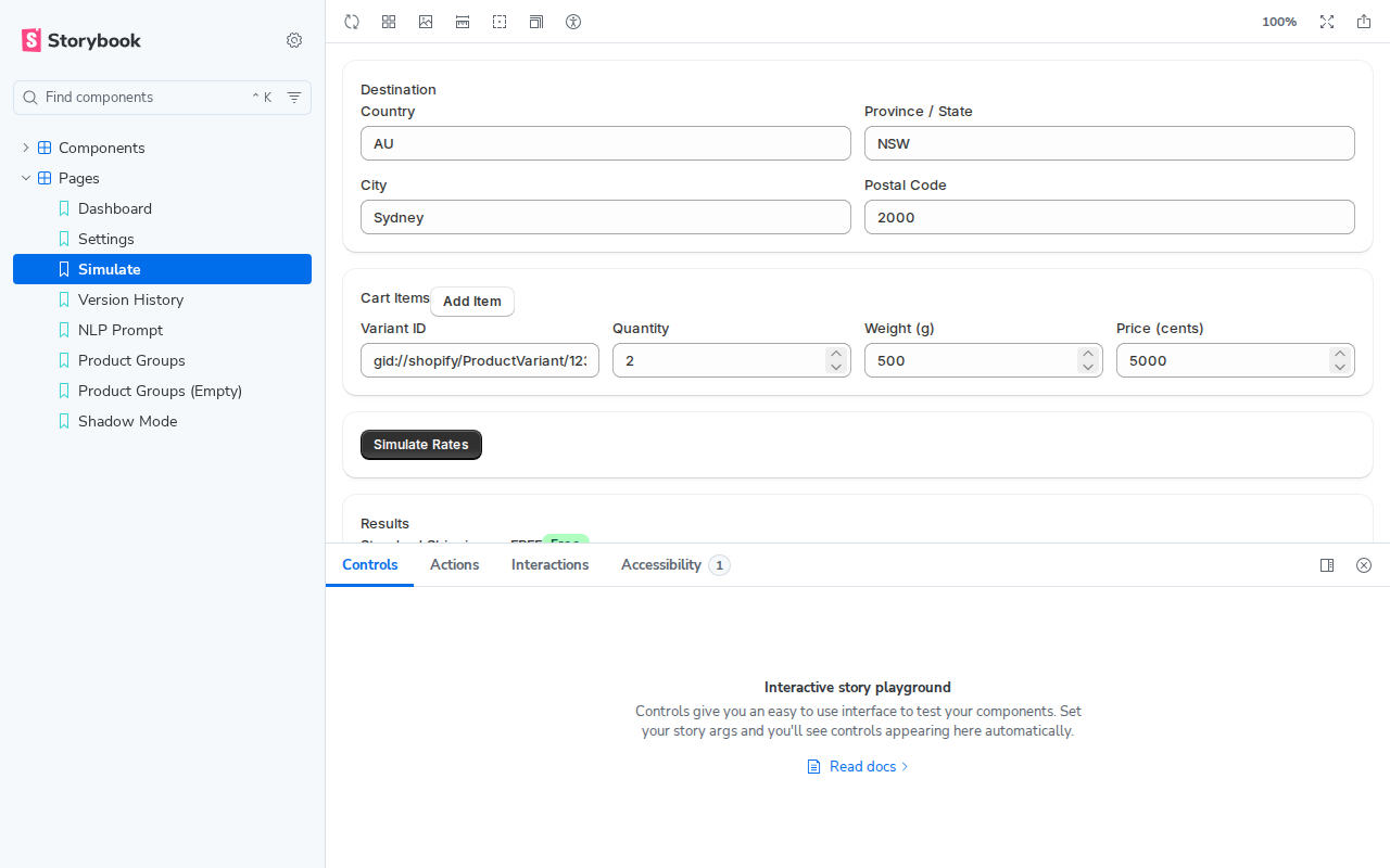
Rate Simulation
The test rates page: destination fields, cart items, and rate results with rule traces.
Component Stories — Building Blocks
Component stories show individual UI elements in isolation. This is where you catch visual inconsistencies before they reach a full page.
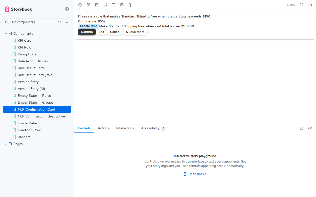
NLP Confirmation Card
What the merchant sees after typing a natural language prompt. Shows the AI's interpretation, proposed operations, and Confirm/Edit/Cancel actions.
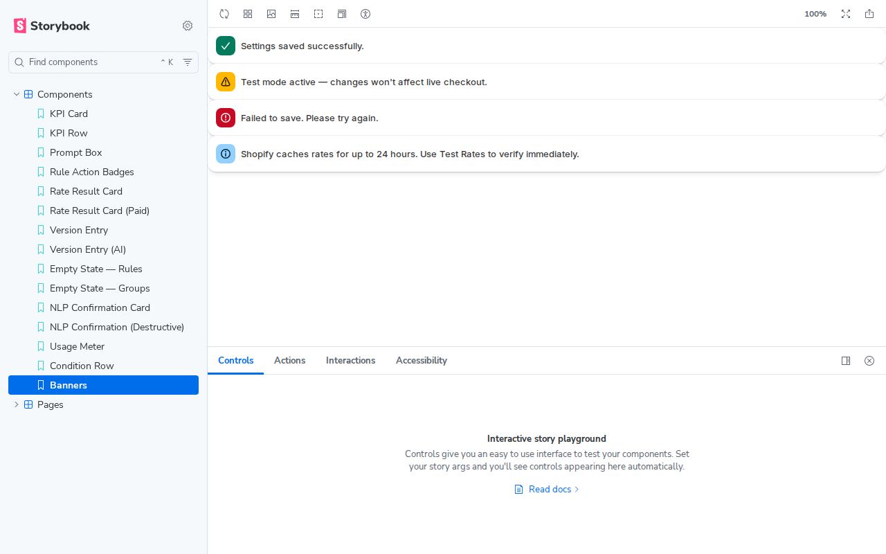
Banners
All four Polaris banner tones: success, warning, critical, and info. These appear as toast notifications and inline alerts throughout the app.
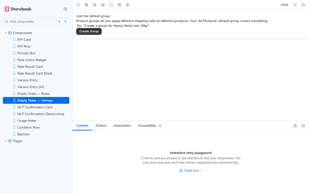
Empty States
What pages look like before the merchant has created any data. Each empty state has a specific message and a suggested first action.
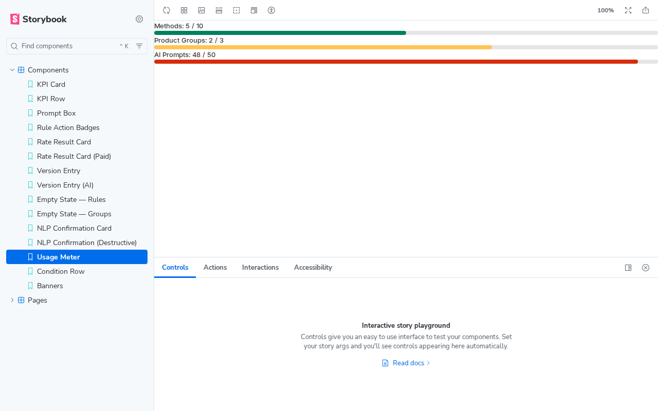
Usage Meter
Plan usage progress bars at three levels: healthy (green), warning (amber), and critical (red).
How Stories Work
A story is a JavaScript function that returns HTML. That's it.
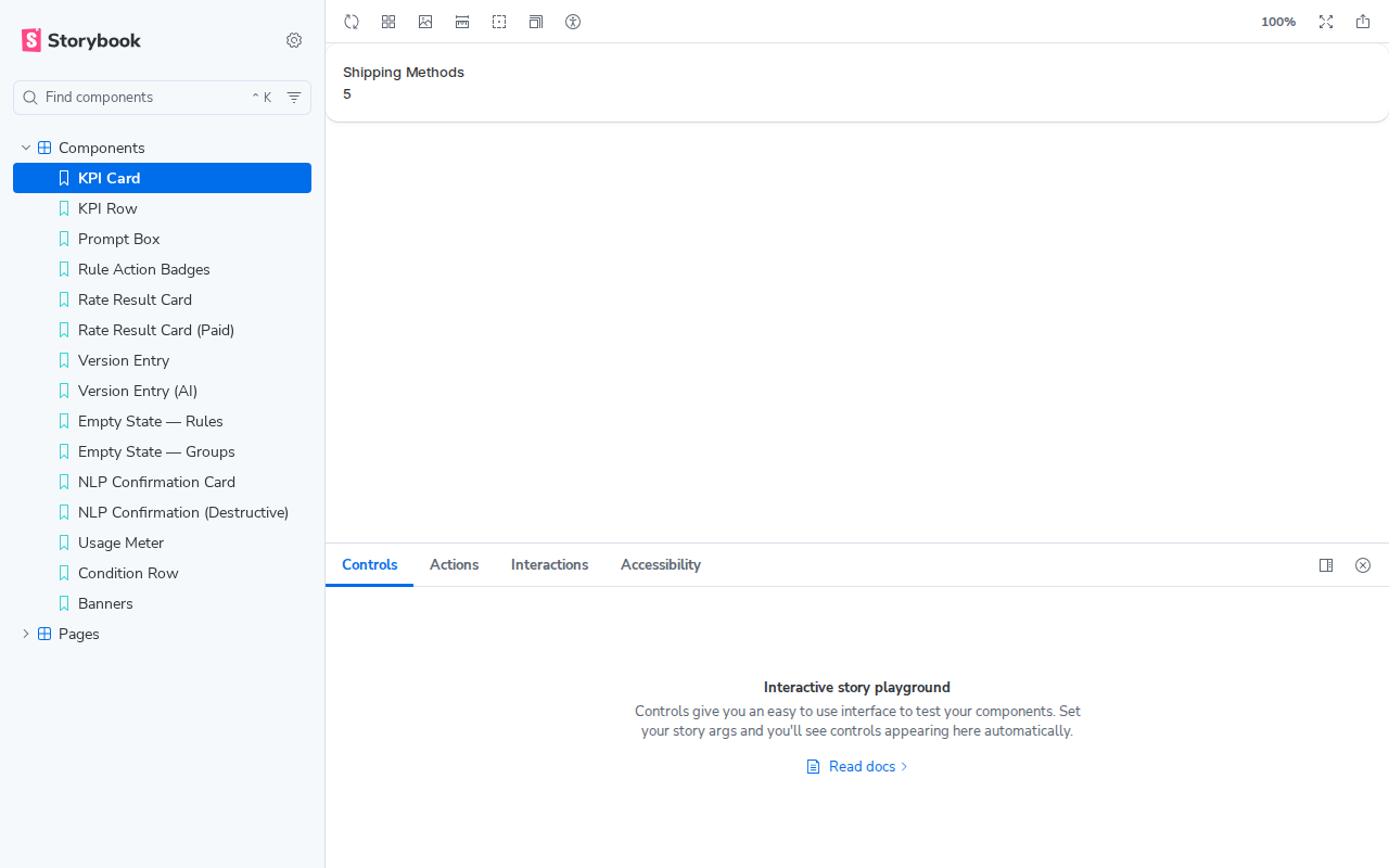
// A simple component story
export const KPICard = {
  render: () => `
    <s-section>
      <s-stack direction="block" gap="100">
        <s-text tone="subdued">Shipping Methods</s-text>
        <s-text type="strong">5</s-text>
      </s-stack>
    </s-section>
  `,
};
The <s-section> and <s-text> tags are Polaris Web Components — Shopify's UI library. Storybook loads Polaris from the CDN automatically, so they render as styled Shopify UI.
<s-*> tags as the real app. What you see in Storybook is what the merchant sees in Shopify.
File Structure
├── .storybook/
│ ├── main.ts ← Config: where stories live, which addons
│ └── preview.ts ← Wraps every story in Polaris <s-app-provider>
├── apps/web/stories/
│ ├── pages.stories.ts ← 8 full page stories
│ └── components.stories.ts ← 15 component stories
Workflow
Before building a new page, write how it should look as a story. This forces you to think about the UI before writing business logic.
Run pnpm storybook locally. Edit the story, see it hot-reload. Iterate until it looks right.
Use the viewport dropdown to switch to 375px. Click the Accessibility tab to run WCAG checks.
Build and deploy to Cloudflare Pages. Share the URL — anyone can review without a Shopify account.
Quick Reference
| Command | What it does |
|---|---|
pnpm storybook | Dev server at localhost:6006 (hot-reload) |
pnpm storybook:build | Build static site to storybook-static/ |
npx wrangler pages deploy storybook-static --project-name shiprules-storybook | Deploy to Cloudflare Pages |
| Term | Meaning |
|---|---|
| Story | One render of a component with specific mock data |
| Canvas | The preview area where stories render |
| Decorator | Code that wraps every story (loads Polaris CDN) |
| Addon | Plugin that adds features (accessibility checker) |
| Meta | Groups stories under a sidebar heading (Pages, Components) |
Click Pages in the sidebar to expand it, then click any page to preview.